We're always looking for opportunities to improve, to give our users more value. Recently, we started asking if there were any changes that we could make to our weekly newsletter that would make it more valuable to our customers?
We started by asking, "What is the job of the newsletter?" We were inspired by this case study from Harvard Business School, where a team set out to help a major fast food chain increase milk shake sales. They studied the data and found that the company sold a large number of milkshakes on weekday mornings. The team wanted to understand why so many people were buying milkshakes in the morning, so stood in one of the restaurants for 18 hours one day and took careful data. They found that for many people, the job of the milkshake was to give them somthing filling and non-messy to enjoy during their long morning commutes.
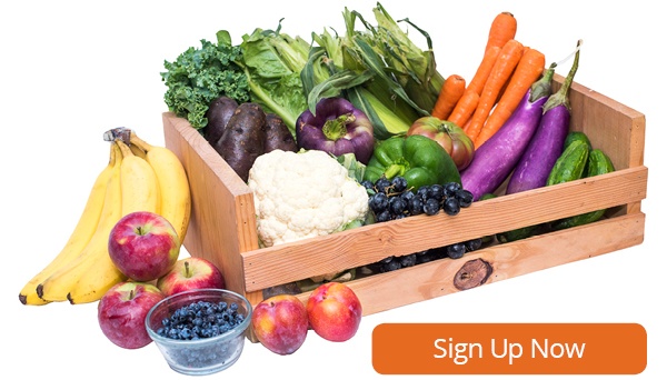
When we looked at the data, we found that for many of our users, the job of our newsletter was to offer them a reminder of what was coming in their weekly box, so that they could update their preferences, add additional grocery items, and use our recipes index to do menu planning.
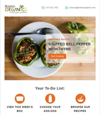
So we tweaked the design, making links to "view this week's box," "choose your add-ons," and "browse our recipes" more prominent.
We also added a "featured recipe" at the top of the page, because we've seen that, with the exception of a handful of "newsy" blog posts (like Organic vs. Non-GMO and our Guide to Organic Apple Picking), our recipes are our most popular pieces of content.
We hope you like the changes and we look forward to hearing your feedback!

